Building online communities
Educational
- WeWork, 173 Oxford Road, Rosebank
- Johannesburg, Gauteng
- 2198
- SOUTH AFRICA
Case Study: Threadless
editForget Logos and Taglines, Threadless Built a Brand on Community
by Brandfolder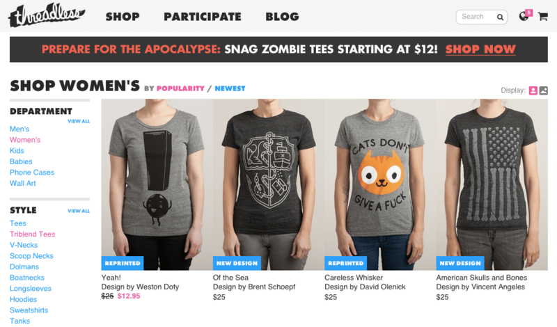
Threadless currently boasts a community of more than 2.4 million artists, designers, and creators. That’s great, but it also means they have 2.4 million brands swimming around their website. This setup has inspired some unique branding decisions throughout Threadless’s 15-year journey that we can all learn from. Brandfolder sat down with three members of the Threadless corporate team—UX Director Billy Carlson, Community Manager Jess Hanebury and Creative Director Craig Shimala—to get an inside look at their brand, company culture, and office décor.
What’s the story behind the Threadless name and logo?
Craig: Back in 2000, our founder Jake Nickell was part of an art forum called Dreamless that hosted different art contests. After he submitted a shirt design and won, he asked himself: “what if I asked my friends to create t-shirt designs and print them?” He started his own competition and it was so well received that he realized it needed to be its own entity. The name is based off of that initial connection to Dreamless.
Jess: You’d be surprised how many people think “Threadless” is about a printing or manufacturing technique. They ask if it means the shirts have no threads—they definitely do.
Billy: The logo is a handwritten font. About three years ago, we did a refresh of the brand, and that’s when it became 3D. We also evolved the “Nude No More” tagline to become “Make Great Together.” It evolved the way Threadless did—we wanted to emphasize creation, inspiration and community. We also did a lot of color changes: we dropped the blue and grey palette for cyan and magenta colors in an attempt to brighten up the brand.
Threadless needs to strike a balance between promoting its own brand and highlighting the art and design work of others. How do you manage that?
Billy: There are a few strategies we employ when it comes to the design of our website and any new feature we build. First, we want anyone who comes to our site to understand what we’re all about. Our use of copywriting and photography build the brand personality we want to convey. Also, we feel it’s important to visually get out of the way of the incredible designs that are submitted and sold on our site. Our site’s UI is intentionally minimal. The interface is monochromatic. We use black, white, and gray for the site structure, then cyan and magenta for the interactive components (buttons, links, etc). Our brand typography is made up of two typefaces, Helvetica and Futura. Each are distinct, yet, simple and geometric. Overall we think of our site as being an elegant frame of a beautiful painting. Our job is to hold the work but to not overshadow it.
Jess: When we’re promoting artists and their unique artwork, that is promoting Threadless. We constantly want to make artists feel celebrated and recognized.
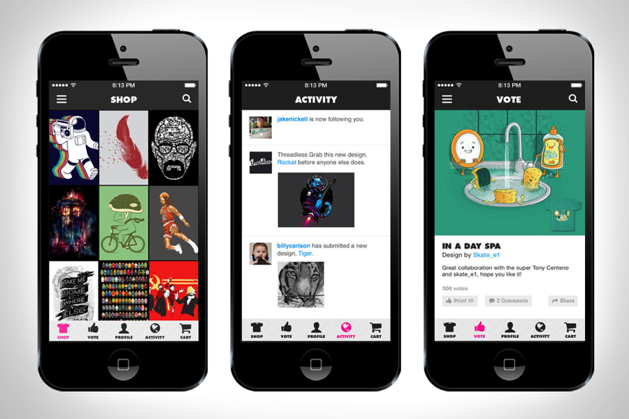
The magic of Threadless is all about the people behind the t-shirts—their ideas, designs and creativity. What are some of your favorite t-shirt designs and why?
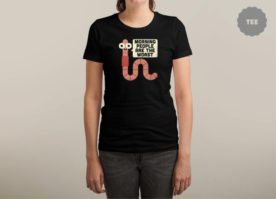
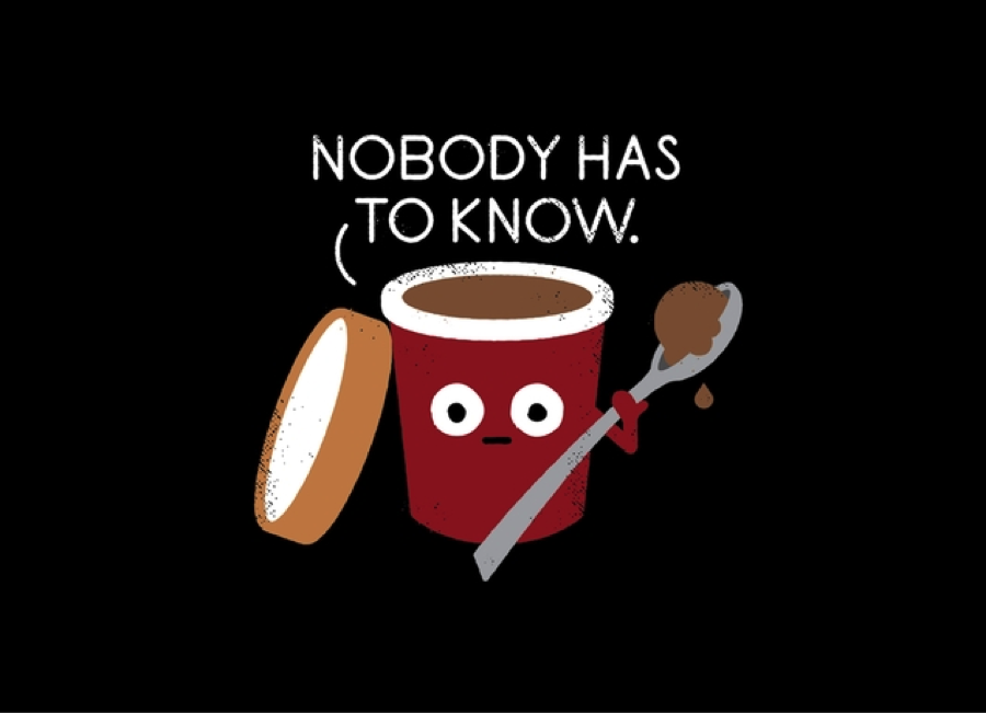
Jess: One of my favorite designers is David Olenick. I like hilarious designs more than beautiful designs. He does corny pun jokes that really resonate with people. His illustrations are very well done but also very simple. That’s what’s cool about Threadless—there’s a different flavor for everyone here.
Tell us about your office space—what does it mean to the employees and customers that interact with the space?
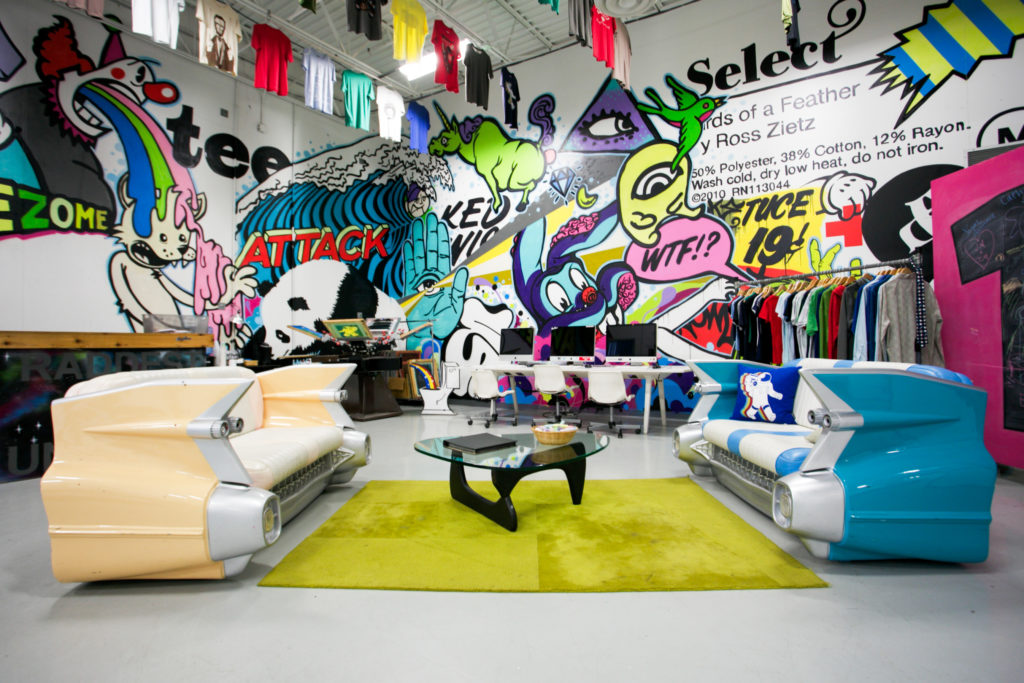
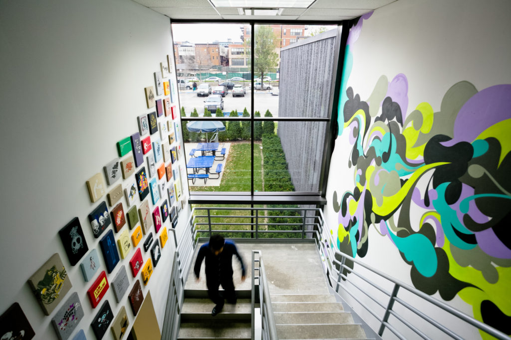
Craig: I love our office space—it’s like a makeshift art studio. Sometimes we have random graffiti artists come in and put something on the wall or we build something ourselves in the office. Everyone has the ability to make it their own. For example, our Warehouse Director, Lance Curran, wanted more graffiti art. So he found some people on Instagram and twitter to do a graffiti mural.
Another employee was obsessed with Pantone and painted the walls around him like different pantone chips. Right now I am staring at a wall of Pantone 279. There are fingerprints of different people who used to work here or still work here. People walk in and wonder how we get work done because there are so many games—it’s like a big adult playground.
Threadless built an incredibly strong community and was one of the first companies to win with the concept of “user innovation.” Fifteen years in, what are some ways you continue to keep the community strong and engaged?
Jess: It’s not easy. Every day we struggle with the balance of bringing new people in and ensuring the artists on site have new things to strive for. We recently restructured our artist contracts so that we now have non-exclusive rights to artwork. Now, since artists can take their designs elsewhere, they are paid based on royalties. There is no guarantee that they will make a whole lot of money and this is a controversial thing for some people. But at the end of day, we want to support artists and help them make money off what they love and want to do.
source: https://brandfolder.com/blog/learn-threadless-takes-ego-branding
Sign in to add your comment.
.png)
